
ART REVIEW
i find that art review is rather confusing. the exhibition adverts are scattered amongst the articles making it often difficult to differentiate. i also find that any interesting images aren't captioned properly so its either read the whole article or look around the surrounding 5 pages to see who the image was by.

FRIEZE
frieze is a rather pleasant magazine. i enjoy the layout, where the adverts were in a big block together and the articles are separate, so it was easy to distinguish.i also like the Pop Culture aspect of it with features on other magazines, music reviews and other things than just art. frieze has another nice feature in the "Back" section where it almost just lists artists that you might find interesting with an image that might take your fancy, a easy way to browse artists and discover new things.
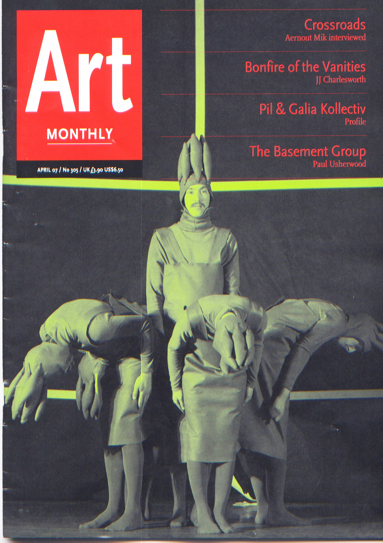
ART MONTHLY
this magazine is in black and white. an art magazine in black and white? seriously? i am very much a flick-though-and-look-at-the-pictures sort of person so a black and white magazine isnt very good. also it appears to just be exhibition review after exhibition review with editorial some adverts and not much else. hmm... not for me.

ARTFORUM
instantly i like the shape of artforum. its a bit heavy but its different. again, like frieze it's decided to separate the adverts and articles for easier reading, but in this case adverts seem to overpower the articles, as its very thick and mainy ads. it has some really interesting articles in it and as it hits the end there is a lot of great content with better reviews than, say, art monthly.
out of my little selection of magazines tried over the year frieze definitely is my favourite, with artforum close behind. they both feel very contemporary and hitting towards a younger audience, whereas art review seems a bit more wordy and grown up. i think frieze's pop culture and music reviews definitely swing it for me.


